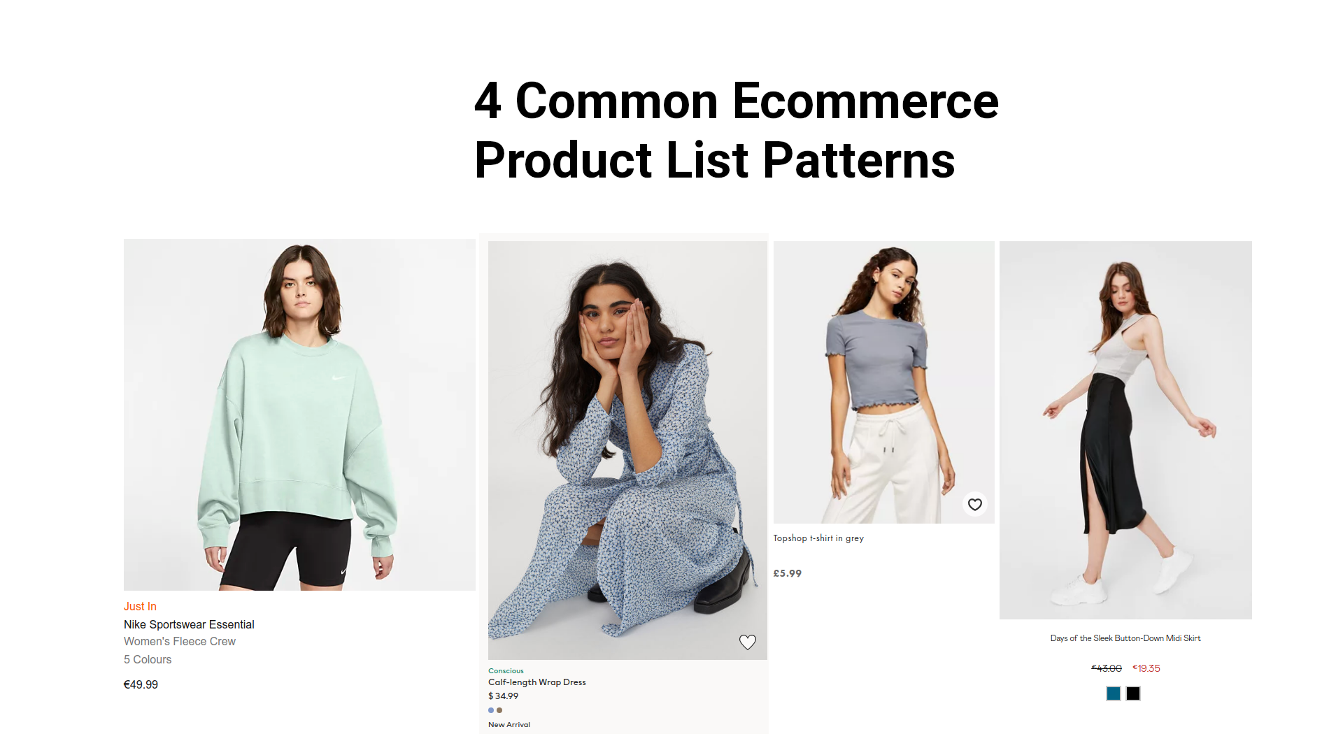
Four Product List Patterns
To increase their sales successful ecommerce stores use common patterns to optimize their product listings. Let's have a deeper look at four of these: 1. Variant indicators 2. Familiar elements 3. Display an alternative picture on hover 4. Contrasting text on complex pages.
Intro
A customer's journey through an ecommerce store includes multiple steps, each providing us with opportunities to optimize the customer experience and to increase conversions. Browsing through product lists and collections is one of the first steps and what we will focus on in this article. We will have a look at optimal ways to display products in collection lists and will discuss popular patterns used to improve product listings by popular online stores.
Learning from the pros
The following patterns are based on an analysis of 12 popular and successful online stores. I explored these stores specifically, because established online shops have already spent a lot of time on optimizing their shops for conversions.
The patterns and this article is based on what I've found in the folloing stores:
The 4 patterns
Four popular patterns immediately emerged while comparing product lists shown by the online stores. While not every store uses each of those patterns, most of them do and there are only slight variations in the use of the pattern.
- Variant Indicators
- Familiar Elements
- Alternative Image on Hover
- Contrasting Text on Complex Pages
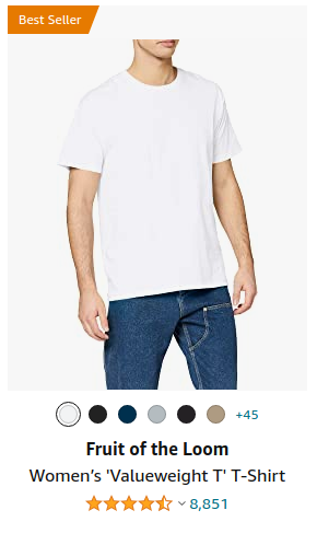
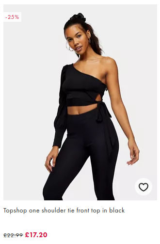
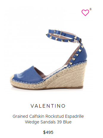
Variant indicators
For products that come in visually different variations, especially colors, there is almost always an indicator to switch between the different variations on the collection page.
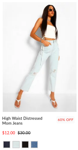
This provides the advantage that we don't need to display the same product in all its variations multiple times in the list. Displaying a long list of the same item in different colors would clearly crowd our product list. However, as we can see in the Amazon example, once we more variations than we can show in a single horizontal line, it makes sense to just display the most popular ones and indicate to the customer that there are more variations on the product page.
Familiar elements
If our customers are familiar with and used to certain interactions on other platforms, we can incorporate these elements into our ecommerce store. Instagram's like button is a great example for this pattern. Using an instagram inspired like button makes any instagram user feel right at home.
Display an alternative picture on hover
While the image in a product list typically serves to give the customer a first impression of the product and to possibly grab their attention, an interested customer will want to see more of a product. The product's detail page is the obvious place where all the information and numerous pictures of a product can be shown, however, there's an intermediate step! Think of hovering over a product, like the first touching the fabric and a slight turn of an item that is still hanging on its rack.
This is achieved by displaying an alternative image, typically one that is in contrast to the initial photo, when the customer hovers of the product.
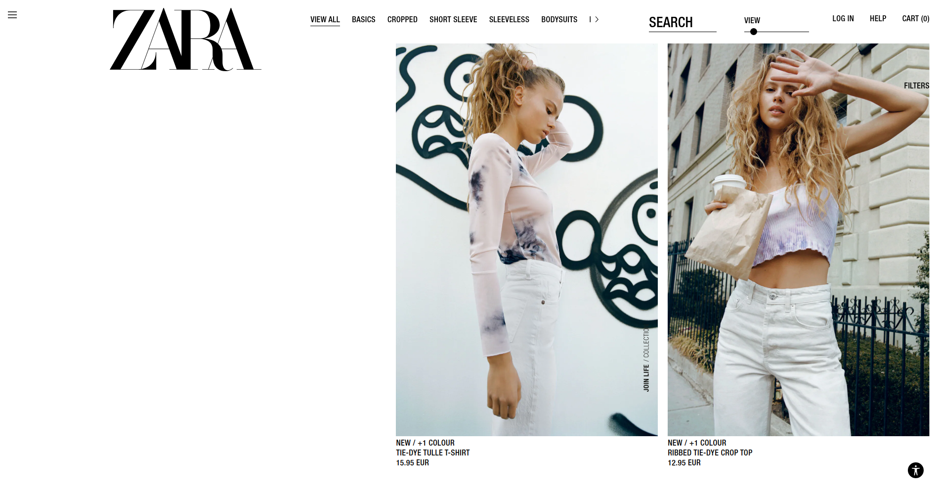
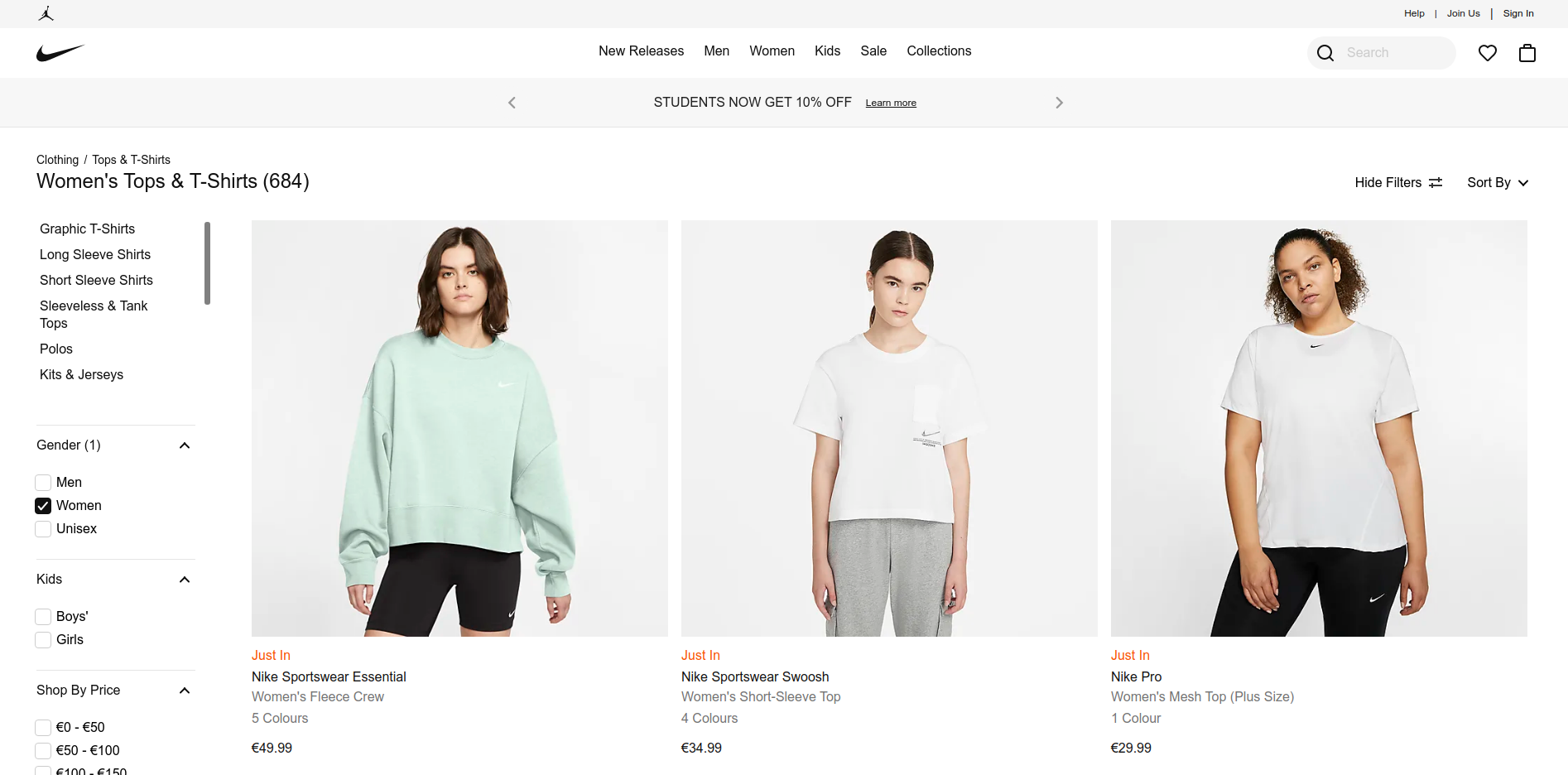
Contrast text elements if many products are shown
The fourth and last pattern depends on the visual crowdedness of the collection the product appear in. This crowdedness depends on the number of products shown on a single screen, the amount of whitespace and how much text we display on each product.
Depending on how visually complex a view is, we need to make it easier for customers to quickly scan different parts in the product listing. This can be achieved by using color to indicate categories or special labels like new arrival, different casing for our text and deemphasizing detail text by making the text lighter in color.
Let's have a look at two contrasting examples.
Zara uses a minimalistic theme. There are very few products on the page and each takes up from 1/3 to the whole page. Therefore, they're able to keep their product descriptions plain.
In contrast, Nike's site displays many items on a listing page, contains filters on the left hand side and generally displays more text on each product. To make each product's description easily readable, without completely overwhelming the customer and distracting them from the product image, they use color and white space.
Summary
We've seen four patterns commonly used by popular and successful web stores. The usage of these patterns makes perfect sense and can easily improve the customer's experience on a shop. Yet many free templates for ecommerce stores do not include these features.